When dealing with colours in scientific visualisations some people like to have a colourmap which can be indexed into to pick specific colours. Whilst this isn't necessarily the best way of handling colours in matplotlib, it certainly adds a degree of familiarity to users who have come over from other visualisation tools, such as IDL.
In this article I'll cover one approach to using the colour-by-index paradigm in matplotlib.
I've created a text file containing byte values for each of the RGB channels. I actually already had this as a numpy array, so wrote it out with:
np.savetxt('custom_colors.txt', colors_array, fmt='%03i', delimiter=', ')
with open('custom_colors.txt') as fh:
    print ''.join(fh.readlines())
import numpy as np

colors = np.loadtxt('custom_colors.txt', delimiter=', ')

# convert to RGB values in the [0, 1] interval
colors = colors / 255.

print colors.shape
import matplotlib.colors as mcolors
my_cmap = mcolors.ListedColormap(colors)
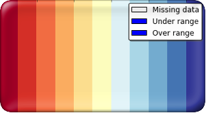
plt.figure(figsize=(20, 0.5))
plt.title('My own color map*')
plt.pcolormesh(np.arange(my_cmap.N).reshape(1, -1), cmap=my_cmap)
plt.gca().yaxis.set_visible(False)
plt.gca().set_xlim(0, my_cmap.N)
plt.show()

* Actually, I borrowed this colormap from Bernd Becker (https://groups.google.com/forum/?fromgroups#!topic/scitools-iris/hsb6ExNgSss).
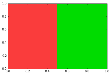
Now that I have a cmap instance I can access specific colors by their index, using the call notation on the colormap:
plt.fill([0, 0, 0.5, 0.5], [0, 1, 1, 0], color=my_cmap(2))
plt.fill([0.5, 0.5, 1, 1], [0, 1, 1, 0], color=my_cmap(3))
plt.show()
It is possible to get all of the RGB values themselves fairly easily:
my_cmap(np.arange(my_cmap.N))
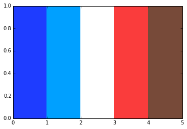
To visualize specific colors using pcolormesh, we need to avoid using a normalization of the data by using matplotlib.colors.NoNorm() and need a 2d array of colors
colors = [4, 11, 0, 2, 17]
plt.pcolormesh(np.array(colors, ndmin=2), norm=mcolors.NoNorm(), cmap=my_cmap)
plt.show()
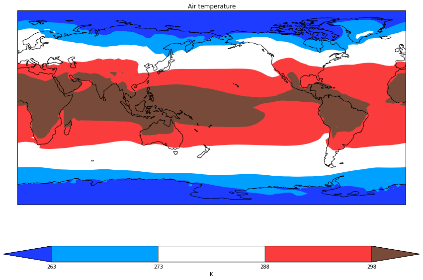
Using a recent change applied to matplotlib (available in matplotlib v1.3 after https://github.com/matplotlib/matplotlib/pull/2002) it is possible to pick specific colours to go with levels when contouring with an extend argument:
import cartopy.crs as ccrs
import iris
import iris.quickplot as qplt


fname = iris.sample_data_path('air_temp.pp')
temperature = iris.load_cube(fname)

colors = [4, 11, 0, 2, 17]
levels = [263, 273, 288, 298]

plt.figure(figsize=(15, 10))
ax = plt.axes(projection=ccrs.PlateCarree(central_longitude=-180))

cs = qplt.contourf(temperature, colors=my_cmap(colors), levels=levels, extend='both')

# Get hold of the colorbar instance and update its extendfrac length
cbar = cs.colorbar[0]
cbar.extendfrac = 0.15
cs.changed()

ax.coastlines()
plt.show()
This article certainly shows a way of handling the colour-by-index paradigm, though it must be said that handling colours like this in matplotlib is not necessarily the best approach - I'll leave that to a future article.
Find this useful? How do you handle colours in your matplotlib figures? Is there a killer feature you think matplotlib is missing out on? Let me know via the comments section.